Overview
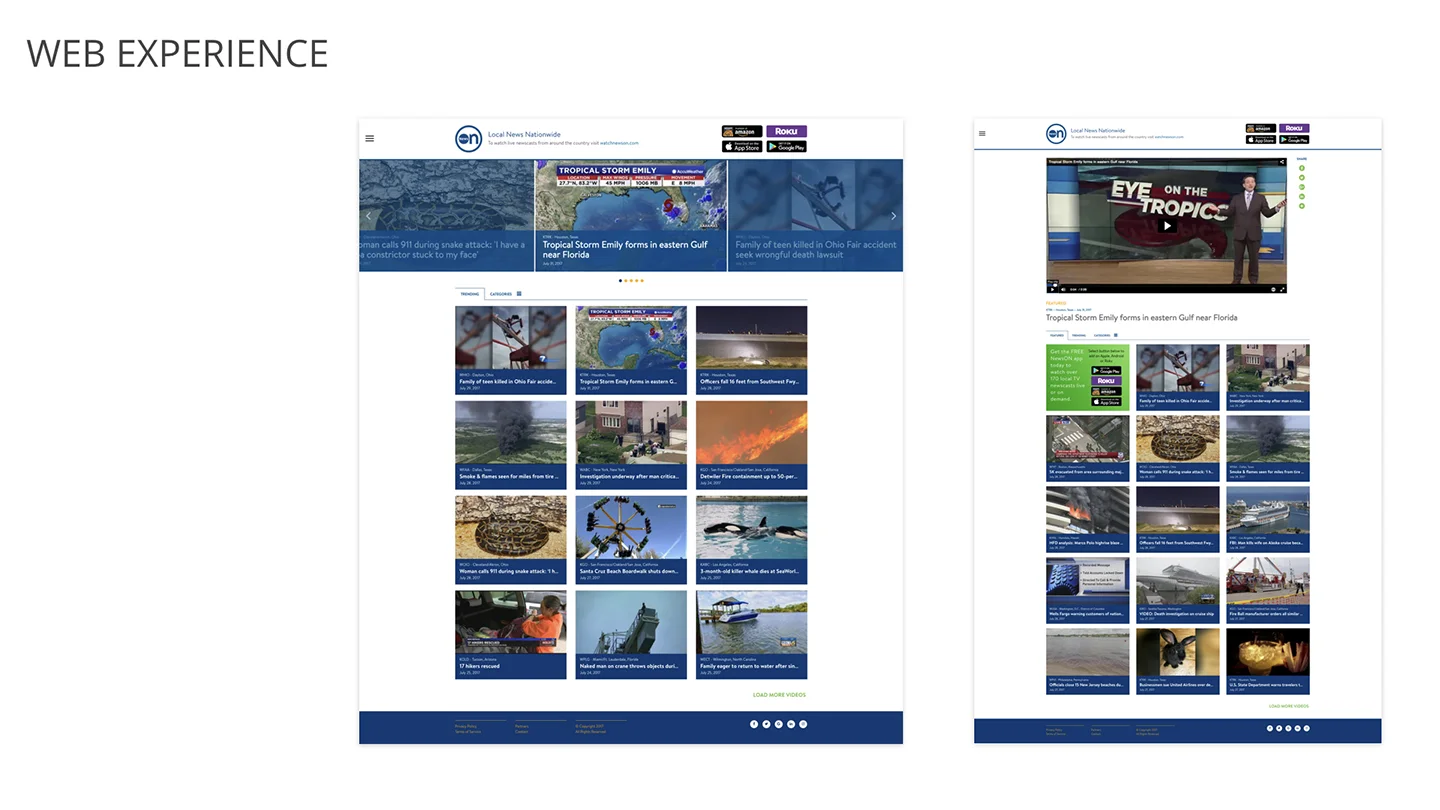
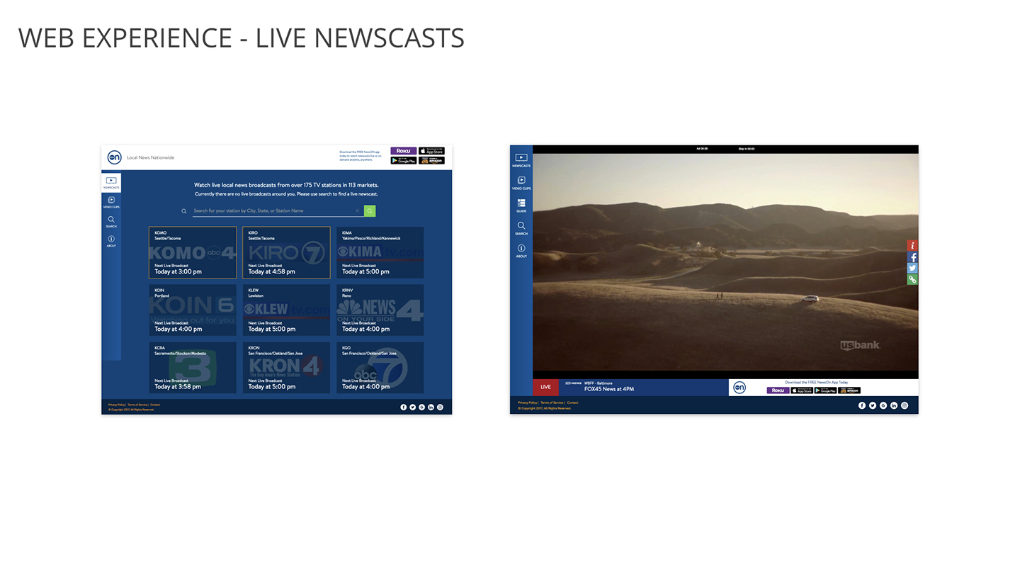
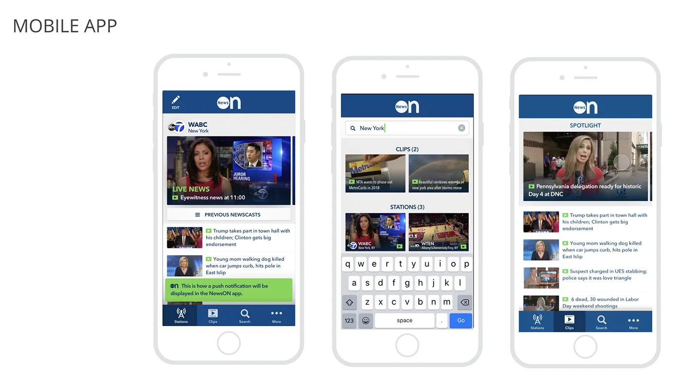
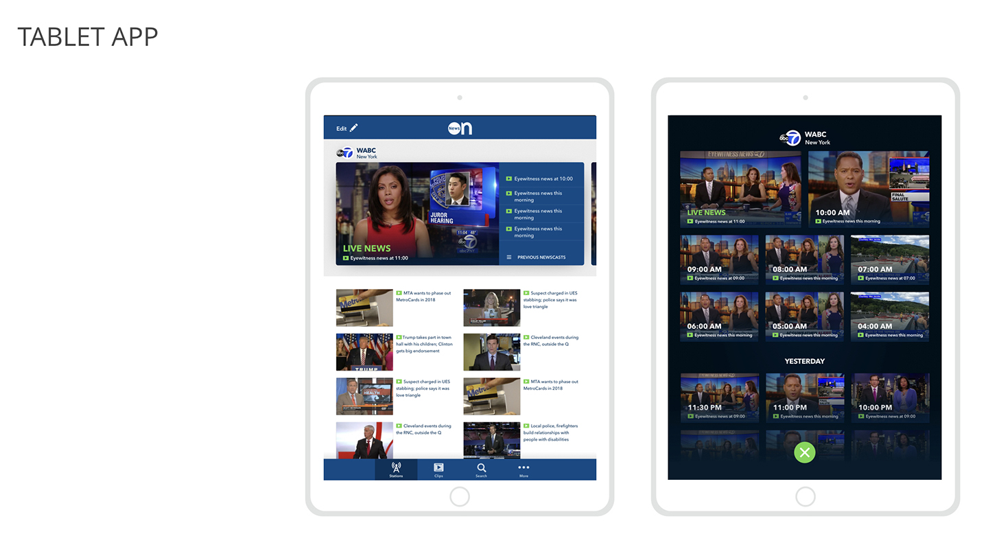
NewsOn also users to watch live and local television newscasts for free. With over 200 local news stations across the US 75%+ coverage users can easily watch their local news live or VOD, and watch previous newscast or clips. Users can set their favorite stations to quickly navigate to the most up to date or breaking content that is relevant to them.
In need of a much needed refresh and redesign of their apps I was asked by NewsOn to assist with the initial UX designs as well as designing the overall look and feel. Though initially the focus was going to be on the mobile app we soon changed course and I was asked to instead focus on their Roku App.
My Role
I worked as an UX and UI designer handling the layout and overall look of the app, working closely with an art director, NewsOn stakeholders, and an external development agency.
Requirements
As the Foozle Apple TV app was being designed as the business and content plans were also being developed initial requirements were loose and sparse. The elements that were specifically called out for inclusion were:
Requirement 1: Home Screen
1. Large teaser of content
2. Latest/previous newscast
Requirement 1: Station Page
1. Station branding or identifying image.
2. Large teaser of content
3. Latest/previous newscast
Requirement 3: Search
1. Ability to search for stations.
Requirement 4: Favorites
1. List of all of your stations
Requirement 5: Breaking News/Live News Zone
1. Somewhere where all of the live content can be collected, possibly the ability to show content based on a specific topic or event
Requirement 7: EPG (Nice to Have)
1. See when a show is live next
2. See what's live
3. Easily flip between stations
The Current App
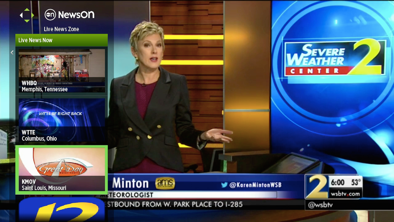
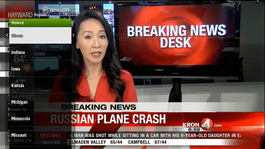
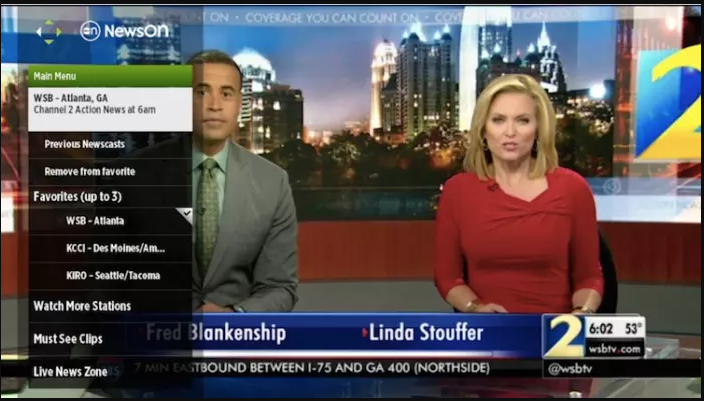
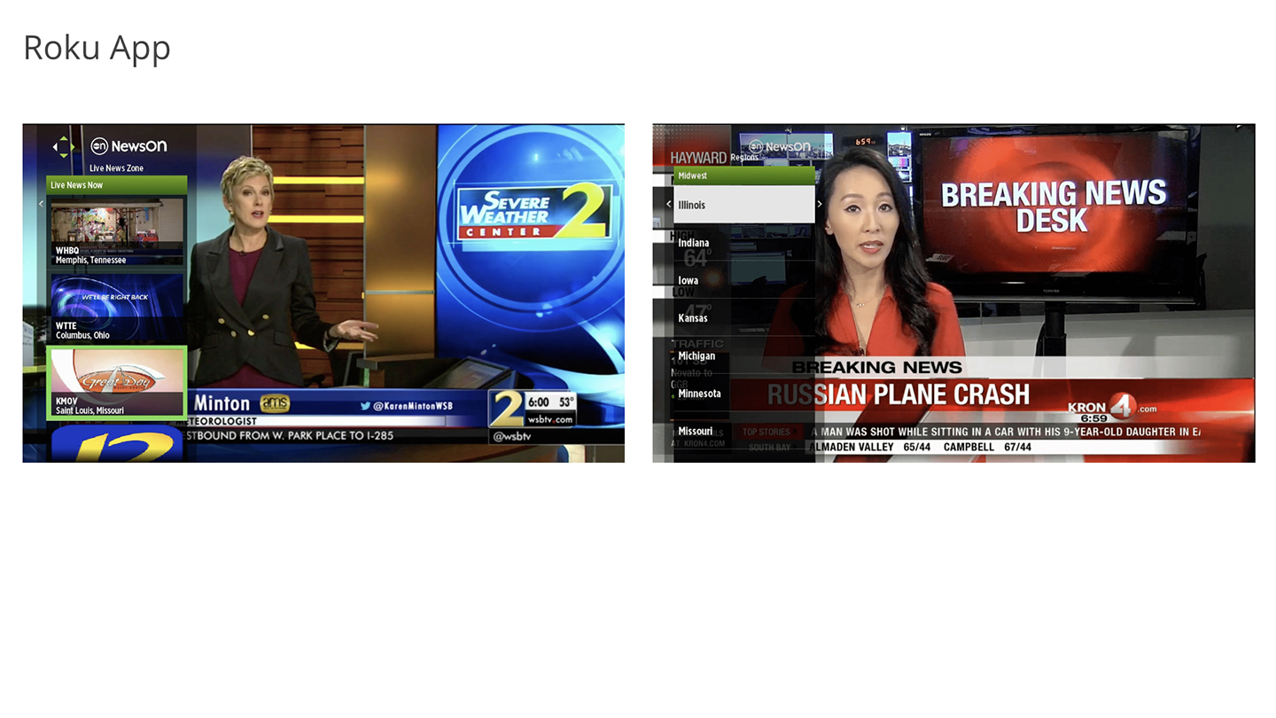
Relatively bare bones the current app allowed user to favorite up 2 3 stations, the first of which would autoplay when the app was launched. It contained a rudimentary search feature where users would have to drill down from region to state to station call letters. A "Live News Zone" would aggrigate all stations currently live from across the country for the user who is just looking for something live.
Research
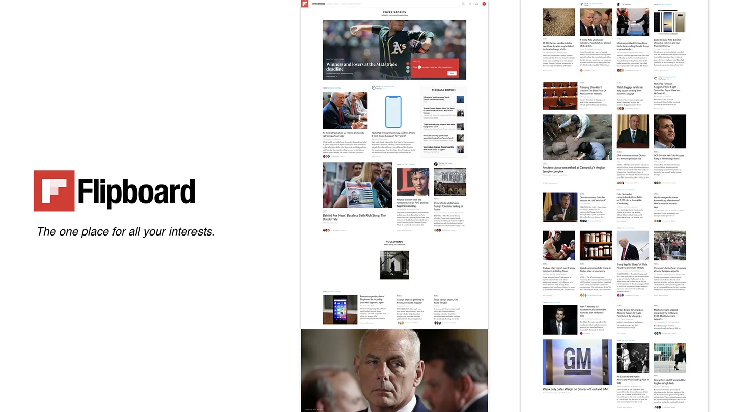
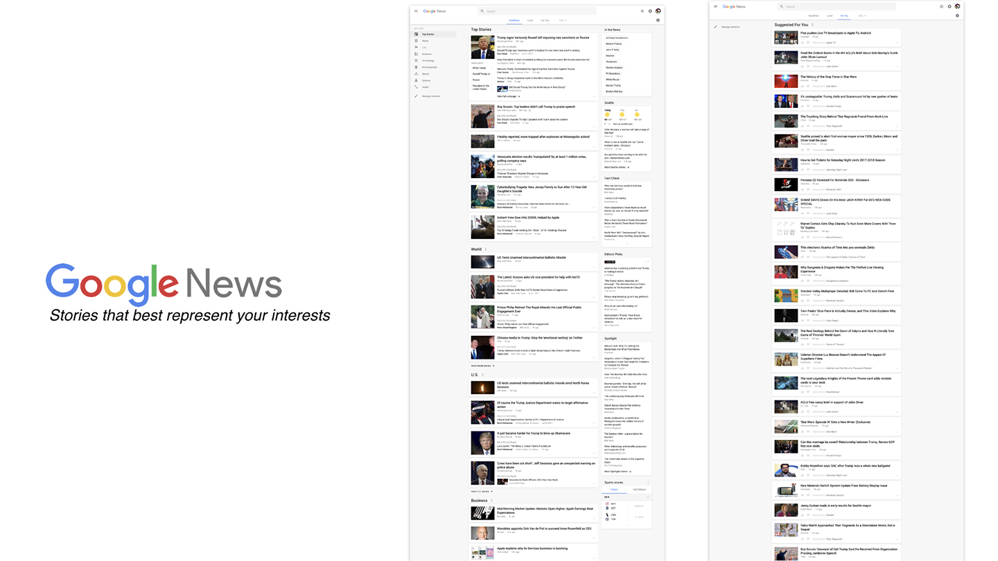
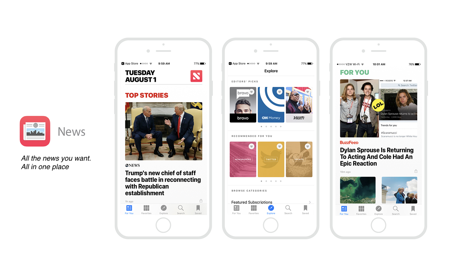
I began the process by doing a deep dive into the current brand standards, products and philosophy as well as some intital competitive analysis (note: at this time we were still under the impression that we would be working on the web/mobile experience first.)
Users
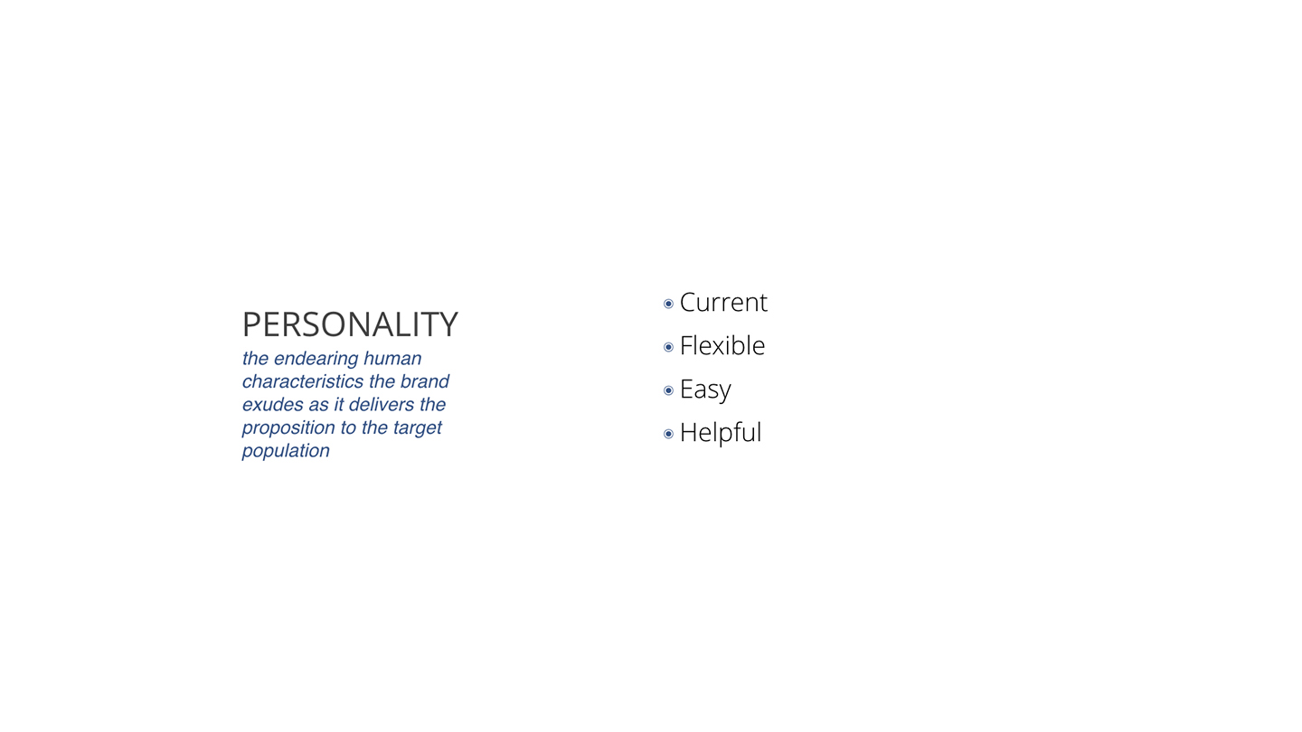
Having collected and analyzed the brand and honed in on who the company saw themselves as we expand to determined who the main users would be. From here we defined 4 persona.
The Browser
Information Hunters and Gatherers
These consumers want to search and browse news. The act of discovery is as important as the news or information itself. They’re “looking to look”
for something, and the process is part of the appeal.
NewsON helps them hunt with a deep set of navigation and discovery tools.
The In-The-Know
First-to-Know Information Pioneers
These 21st-century information pioneers strive to be the first to know, to never miss out, to be the source of what gets shared. They want to find and provide viral content as a form of social currency to appear in-touch and impress others.
NewsON’s breaking news alerts serve them and help them win the information race among friends.
The Mom
This group is most concerned with having pertinent information to aid and protect their close circle of friends, family and loved ones. They desire any type of news or information that helps them guard the physical, mental or financial wellbeing of those close to them.
NewsON supports them with easy access traffic, weather, business and breaking news that matters across the locations they care about.
The Journalist
Social Knights
Knights are the curators of news and information. They are “out in the world,” and seek to capture and share wisdom with others. Rather than providing the flavor-of-the-day information, they hope to learn and offer well-rounded, well-informed viewpoints to their social circles to advance healthy debate and meaningful dialogue.
NewsON helps them discover the worlds they inhabit – whether permanently or on their journeys – and to create community based on shared information.
Solutions
Results
Taking into account the market research and stakeholders requirements I quickly got to work creating an initital concept.
Home
The primary concept of the new experience is that it would:
1. Get the user to the content they want as soon as possible
2. Easily navigate between customized content
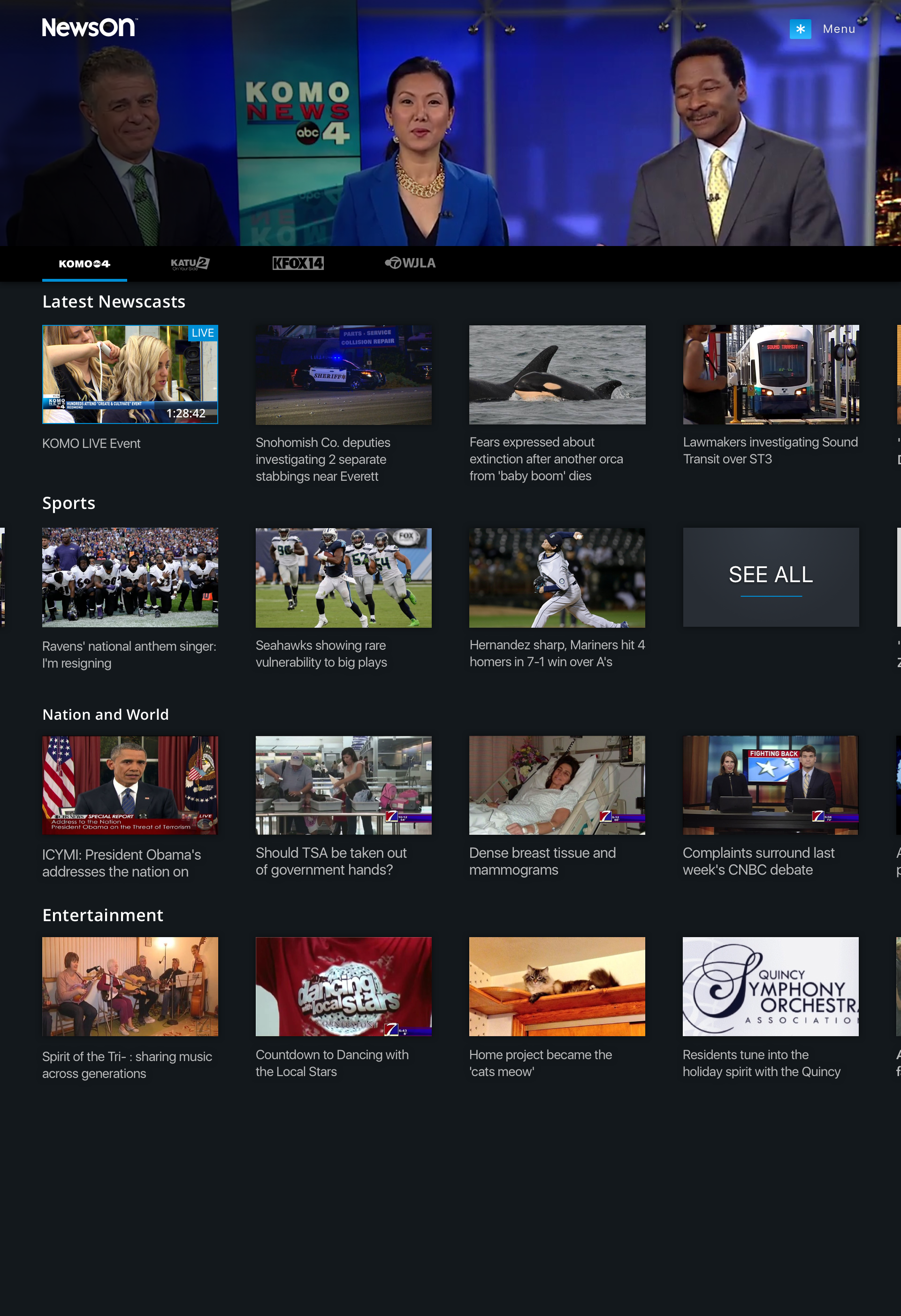
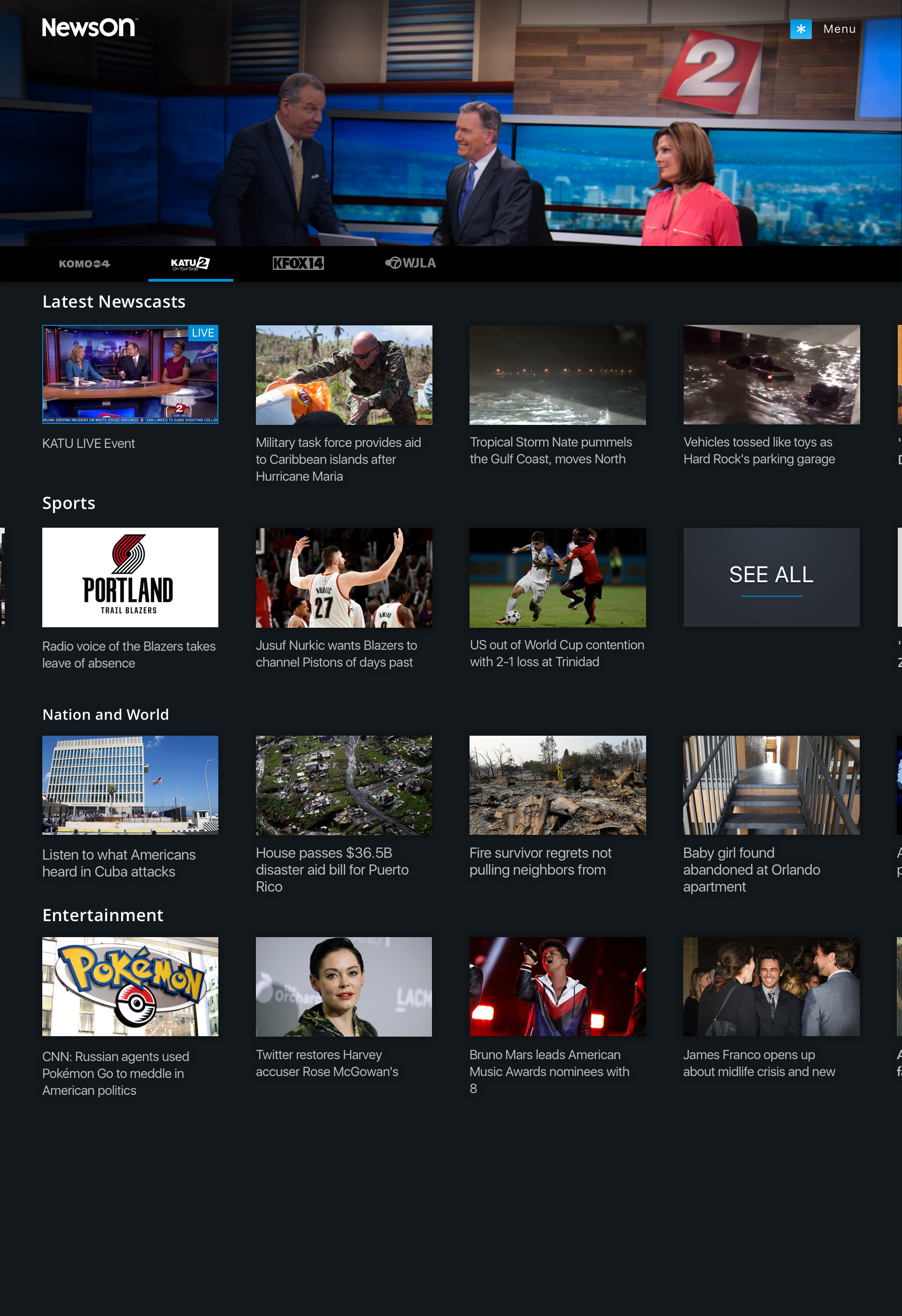
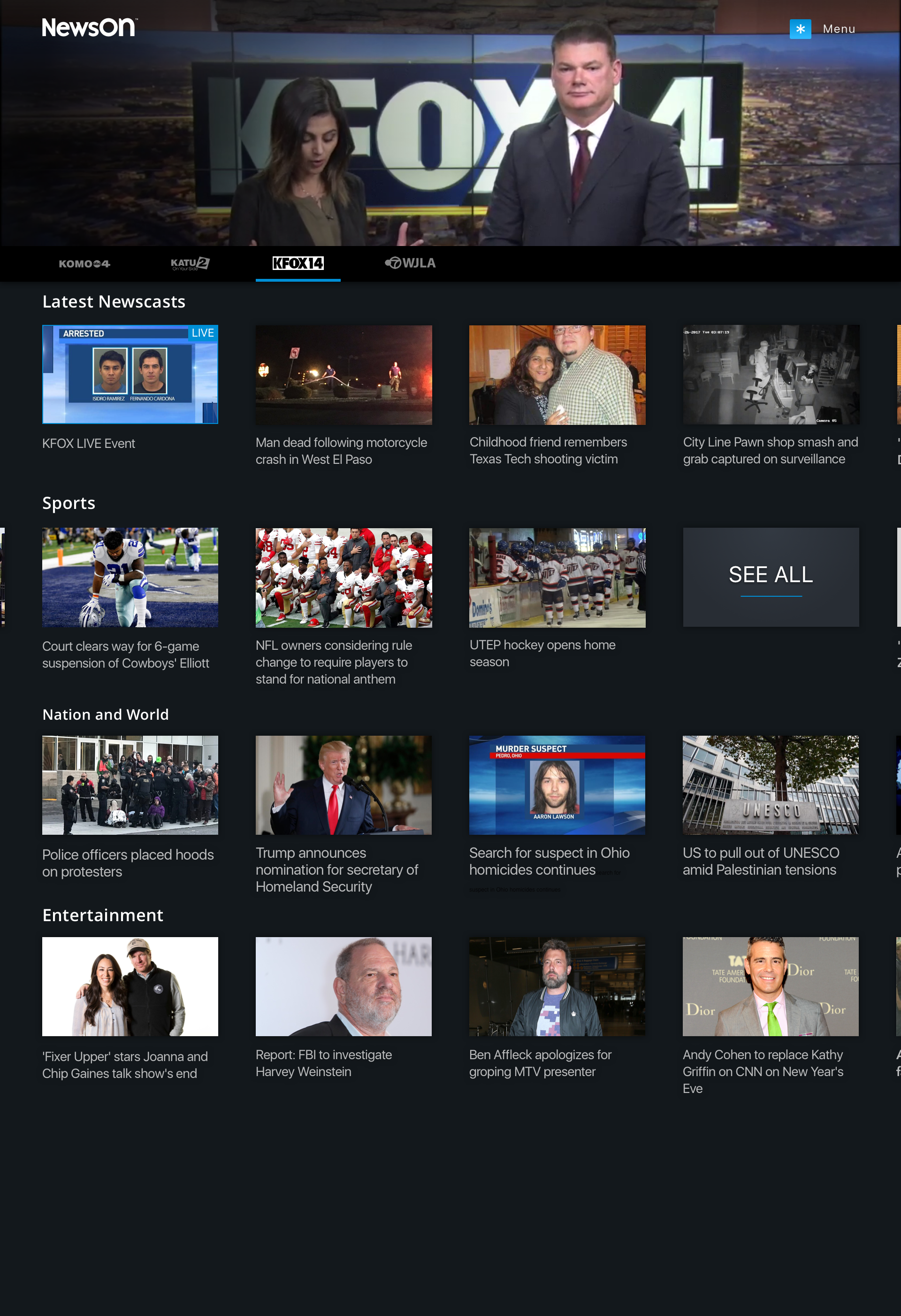
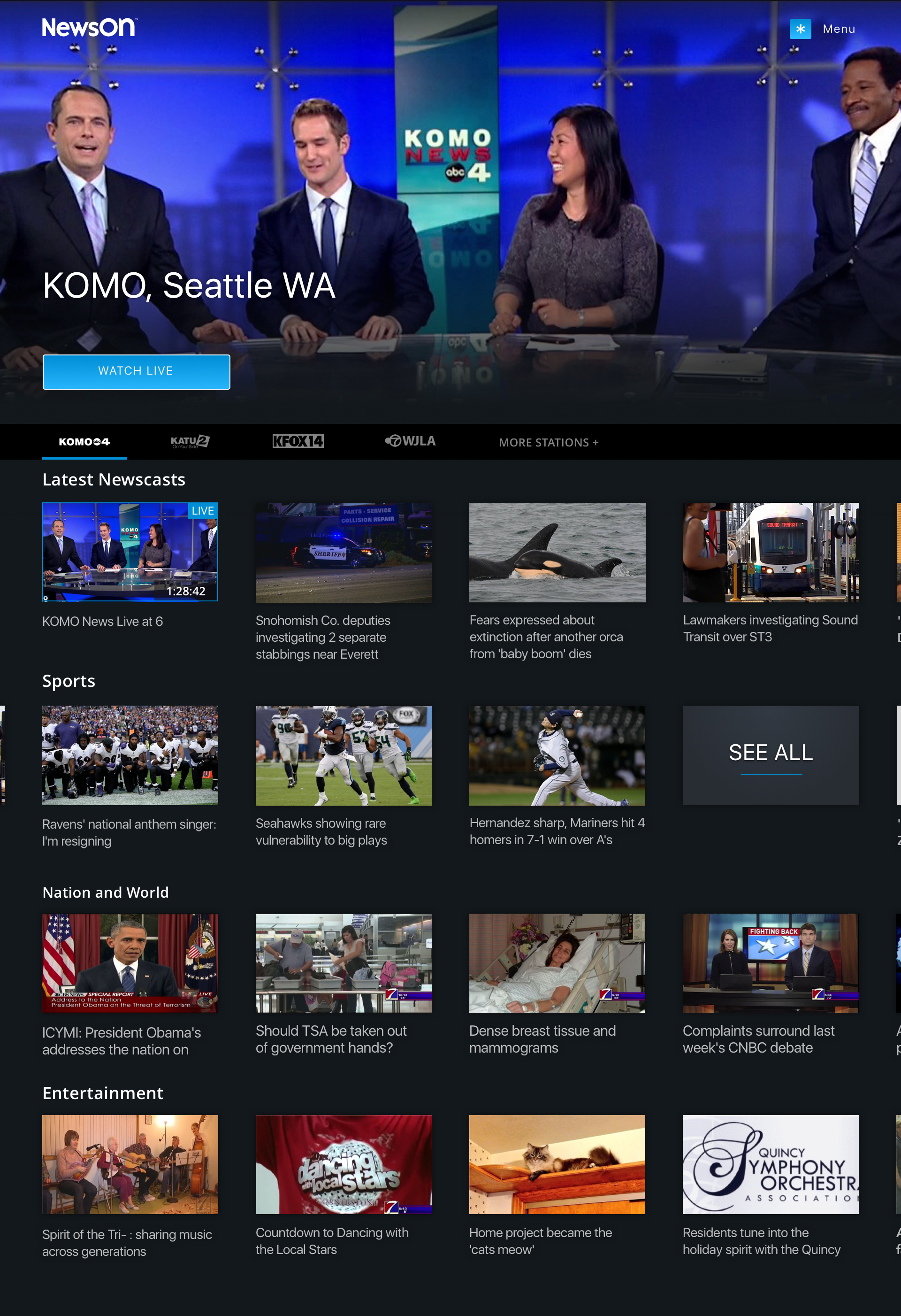
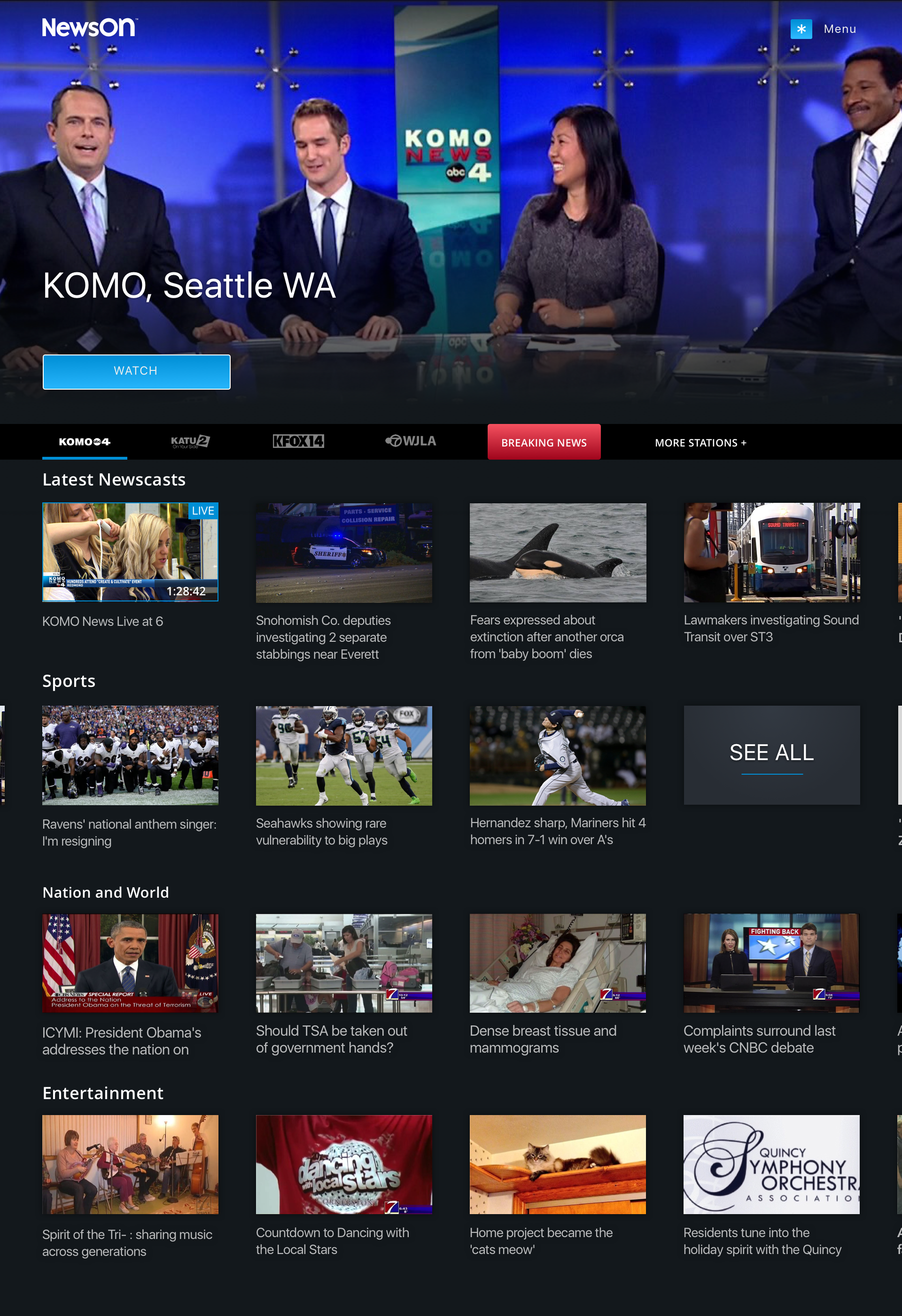
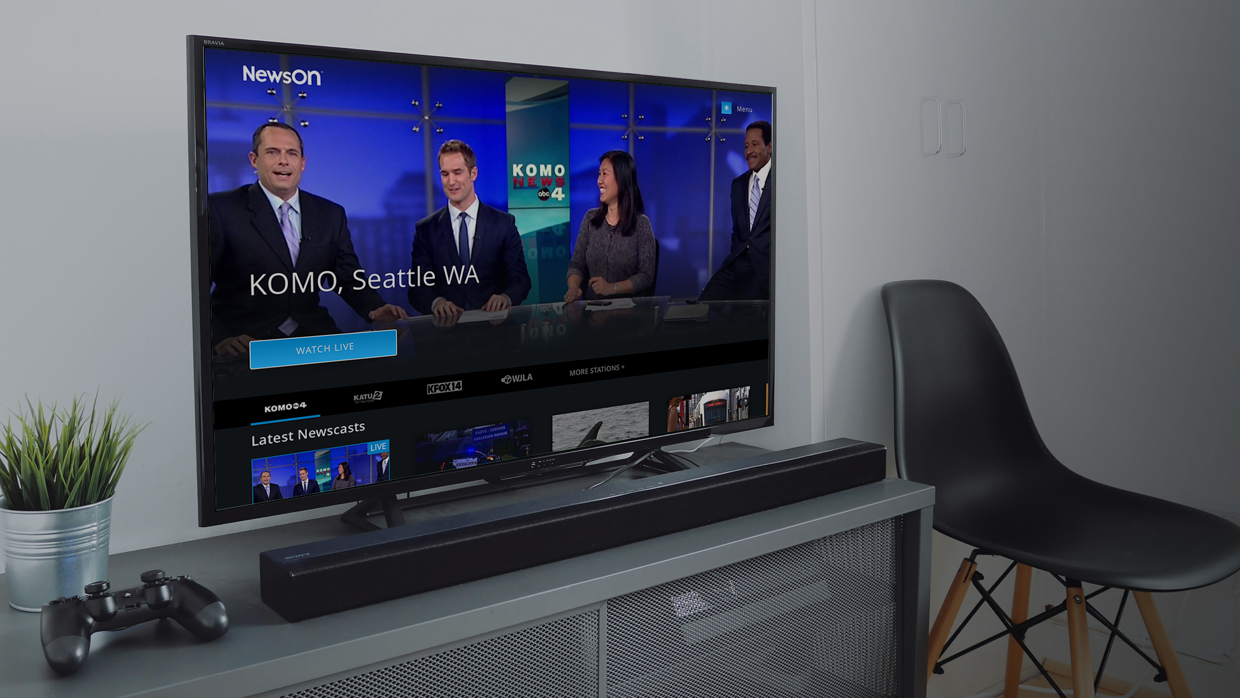
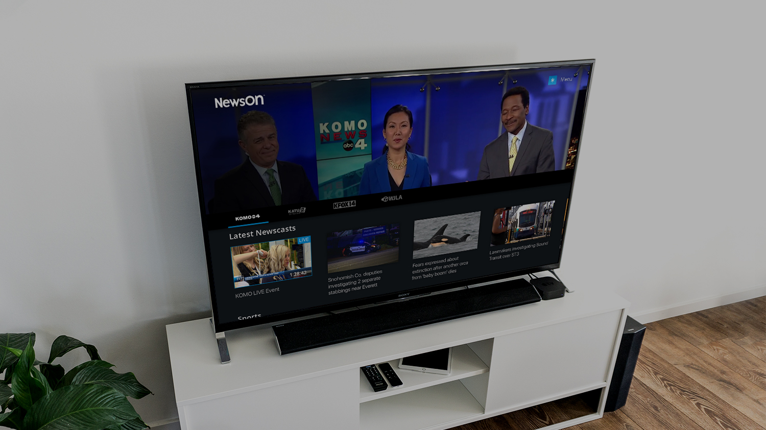
This was achieved by first having either the live or latest newscast autoplay as a hero at the top of the home screen, the user could then either select the hero to go to the full screen experience or navigate to other stations, clips or newscasts. By eliminating a traditional home page in favor of going to a stations page the user is immediately served content that is directly relevant to them.
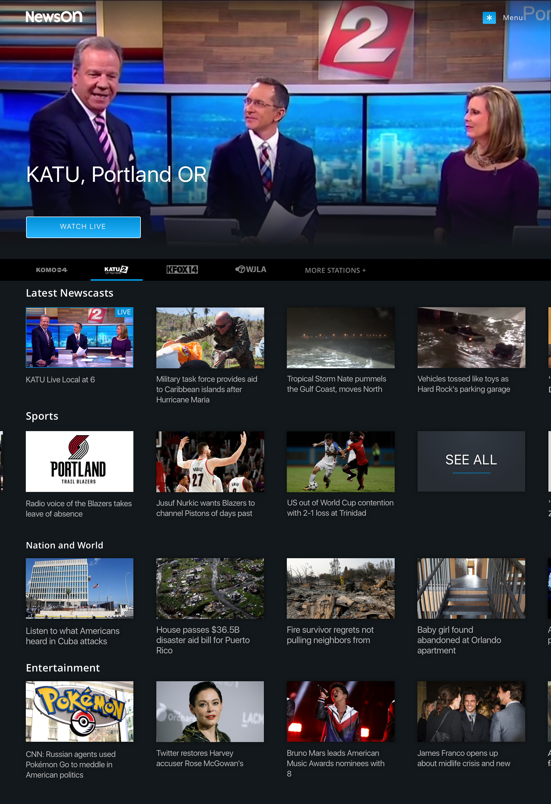
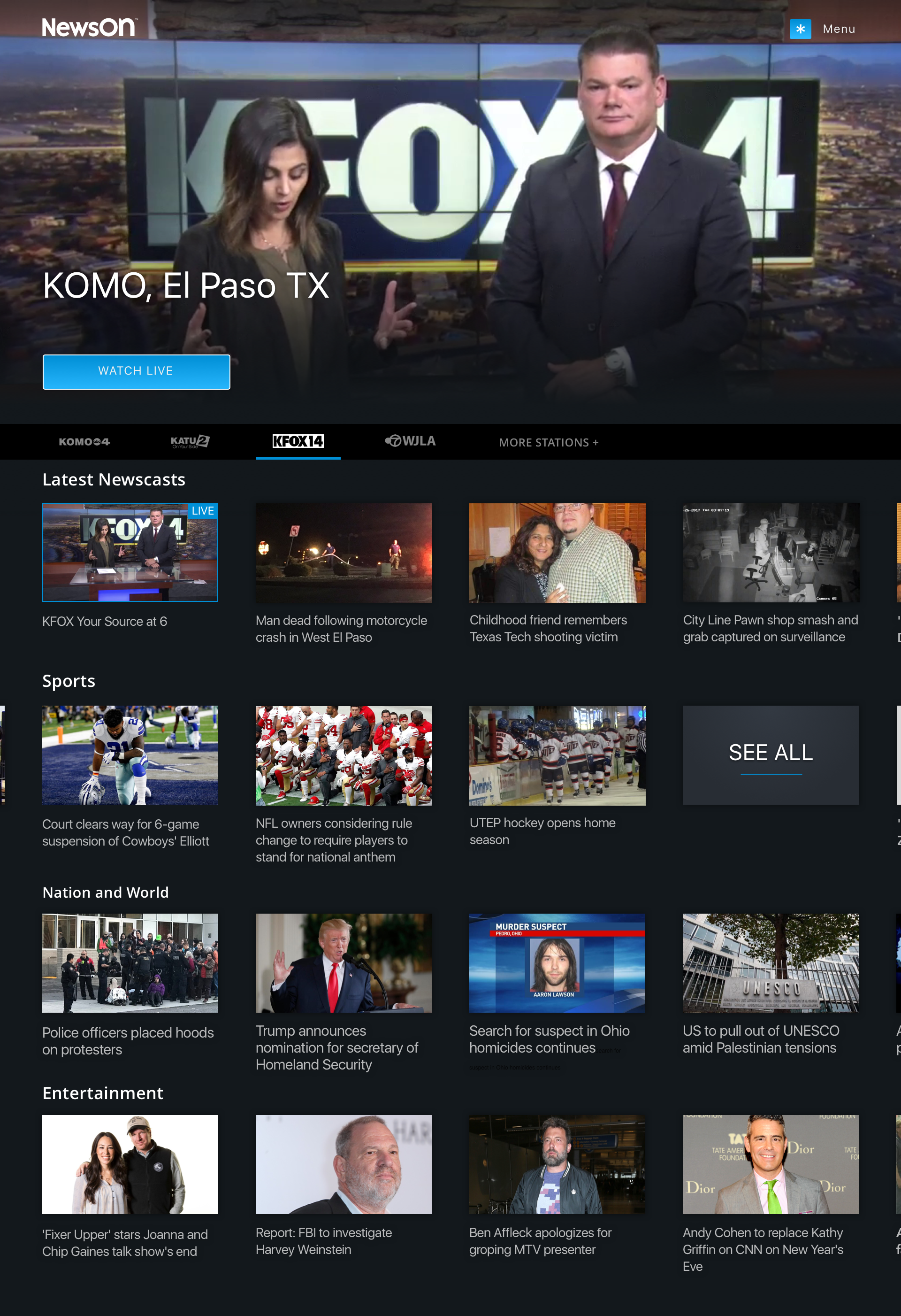
Directly below the live playing hero is a navigation bar generated by the users saved/favorited stations. As the user "flips" between stations both the hero player and all of the content below would be repopulated by that stations content.
In additional to the latest content from the station I also introduced categories of past content for that user that just need to get their sports or national news fix.
Home (variants)
In addition to the primary design a few slight variations we also presented
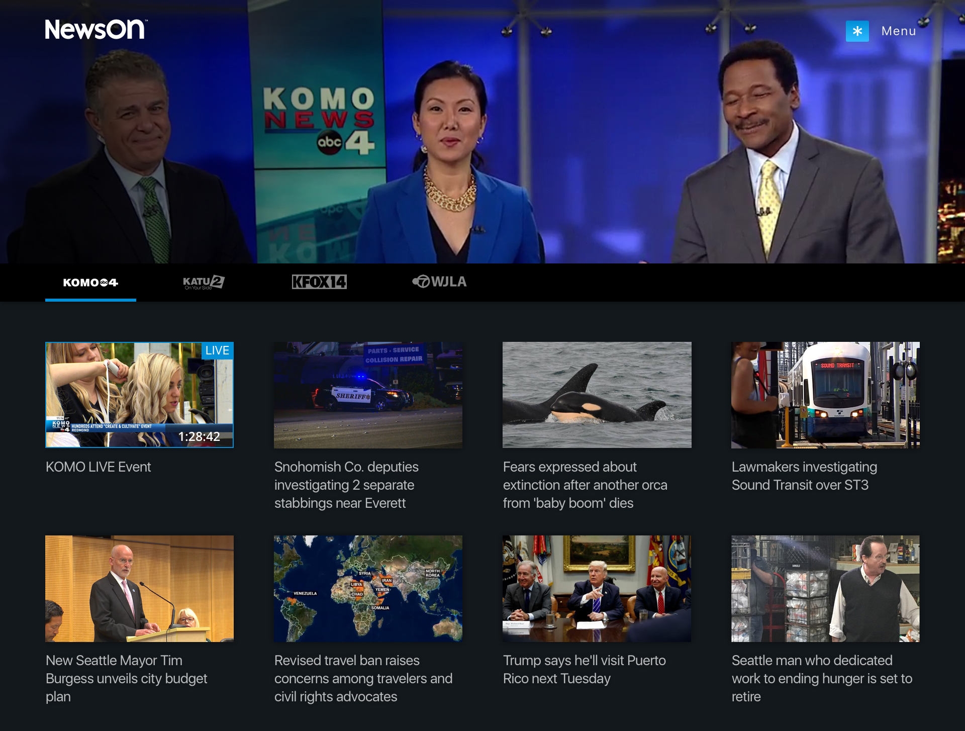
1. Eliminating the sections and having just a chronological grid of station content. This simplification would diminish the development lift for these pages.
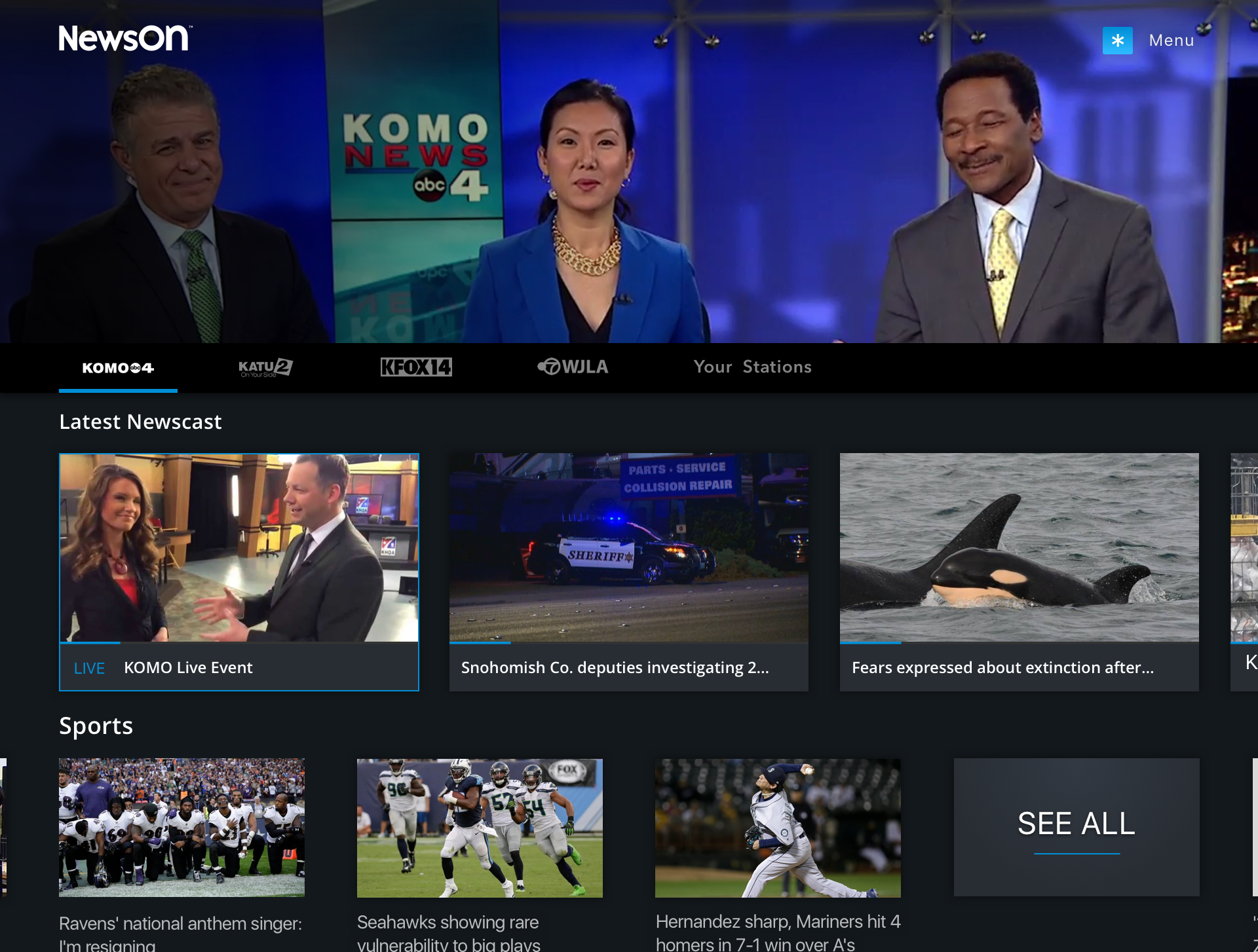
2. Large teasers for the live/latest newscasts which brings extra focus to that conent
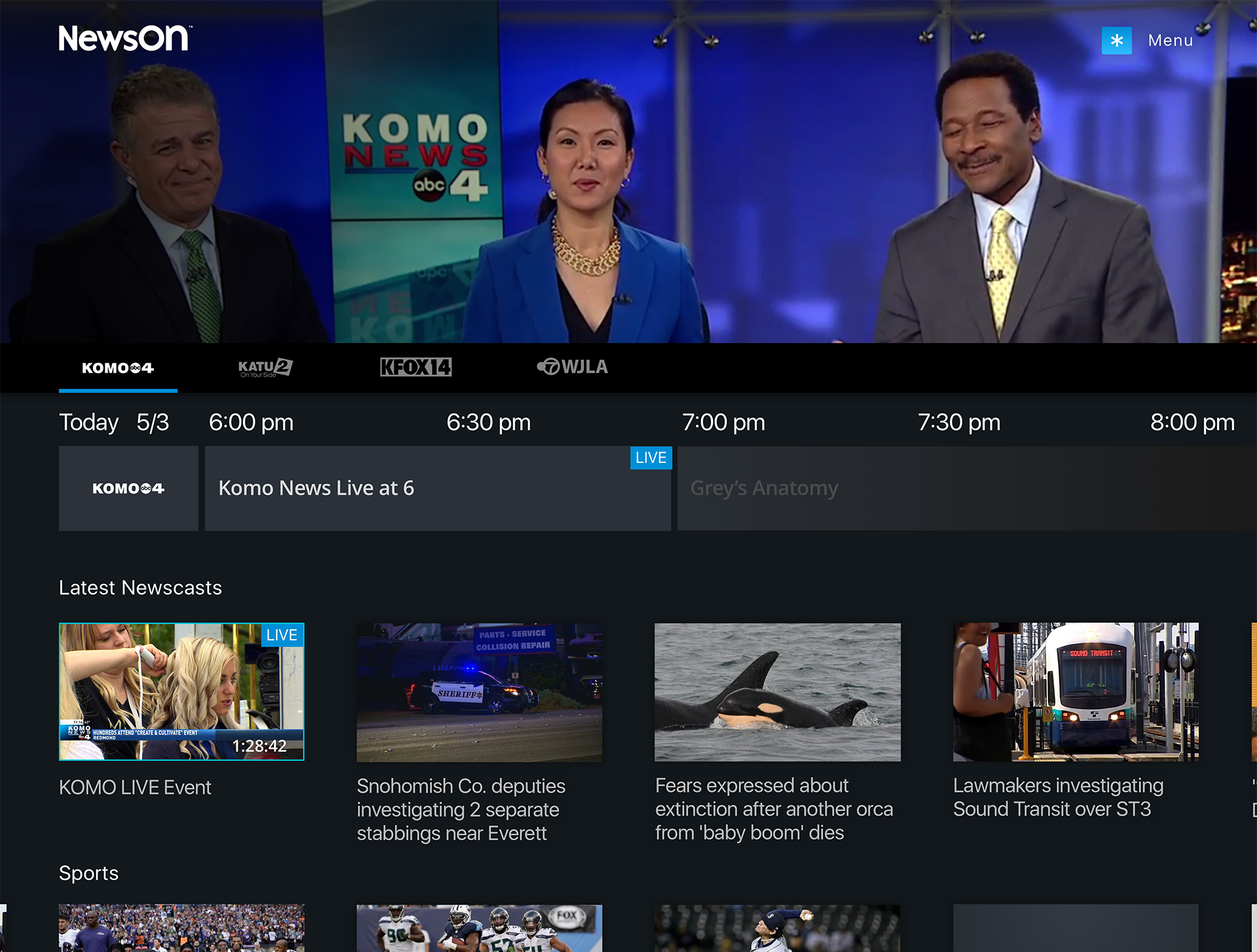
3. Integrating the EPG in the show page which would allow the user to know when the station will next have a live newscast.
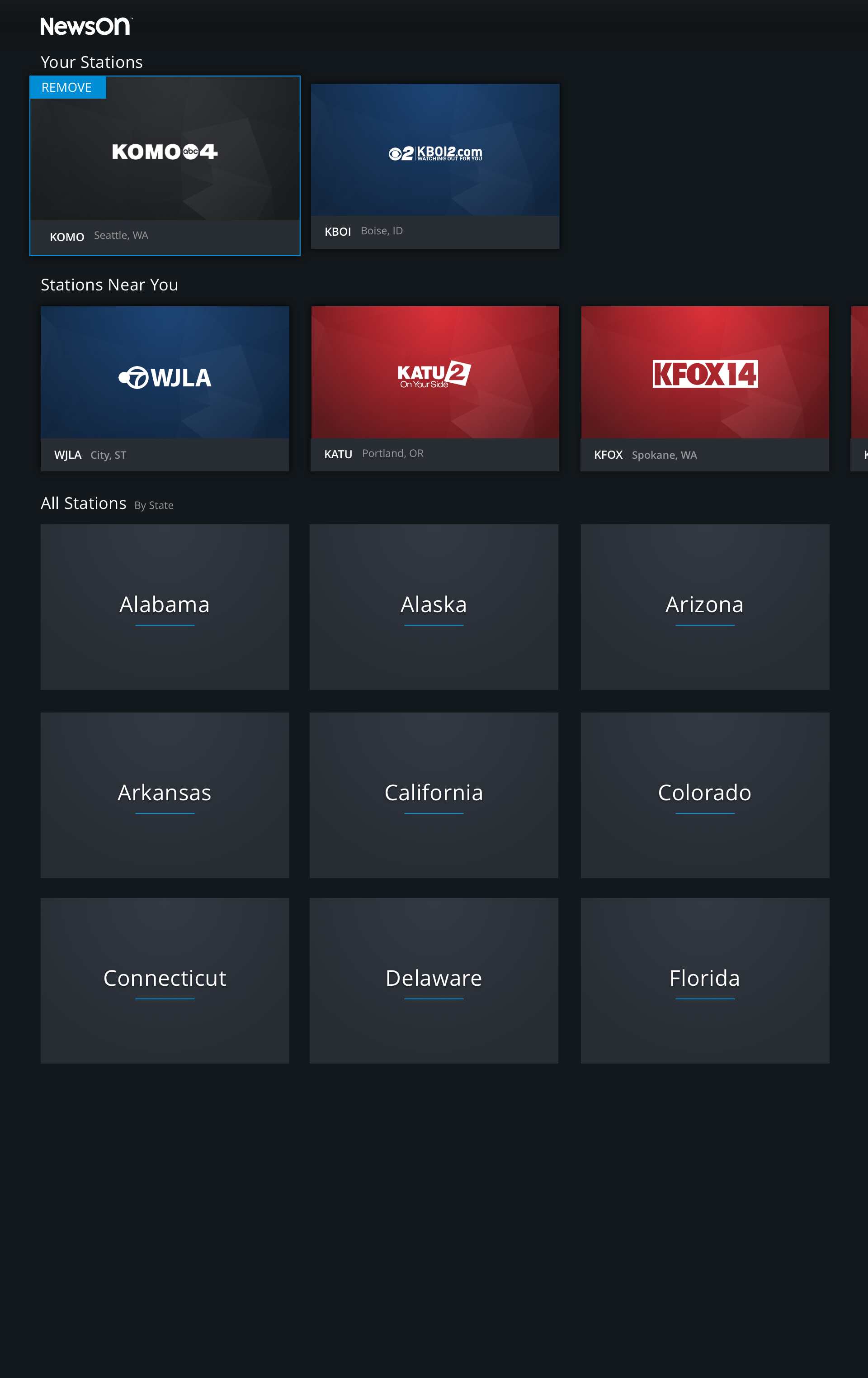
Your Stations
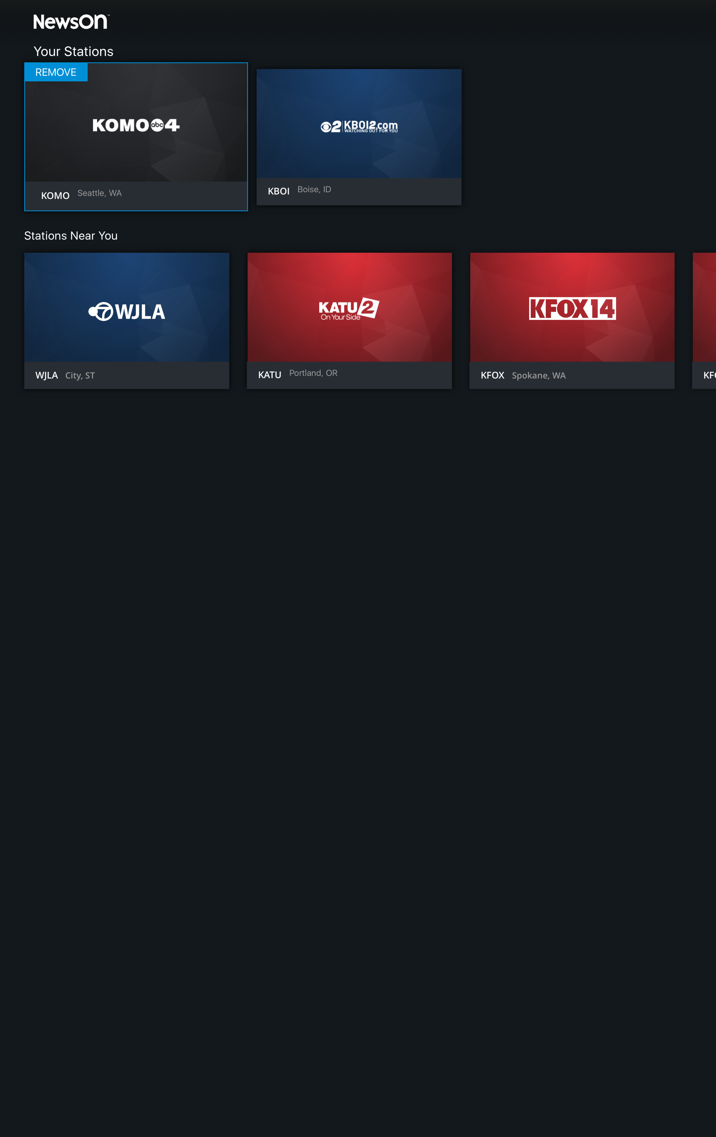
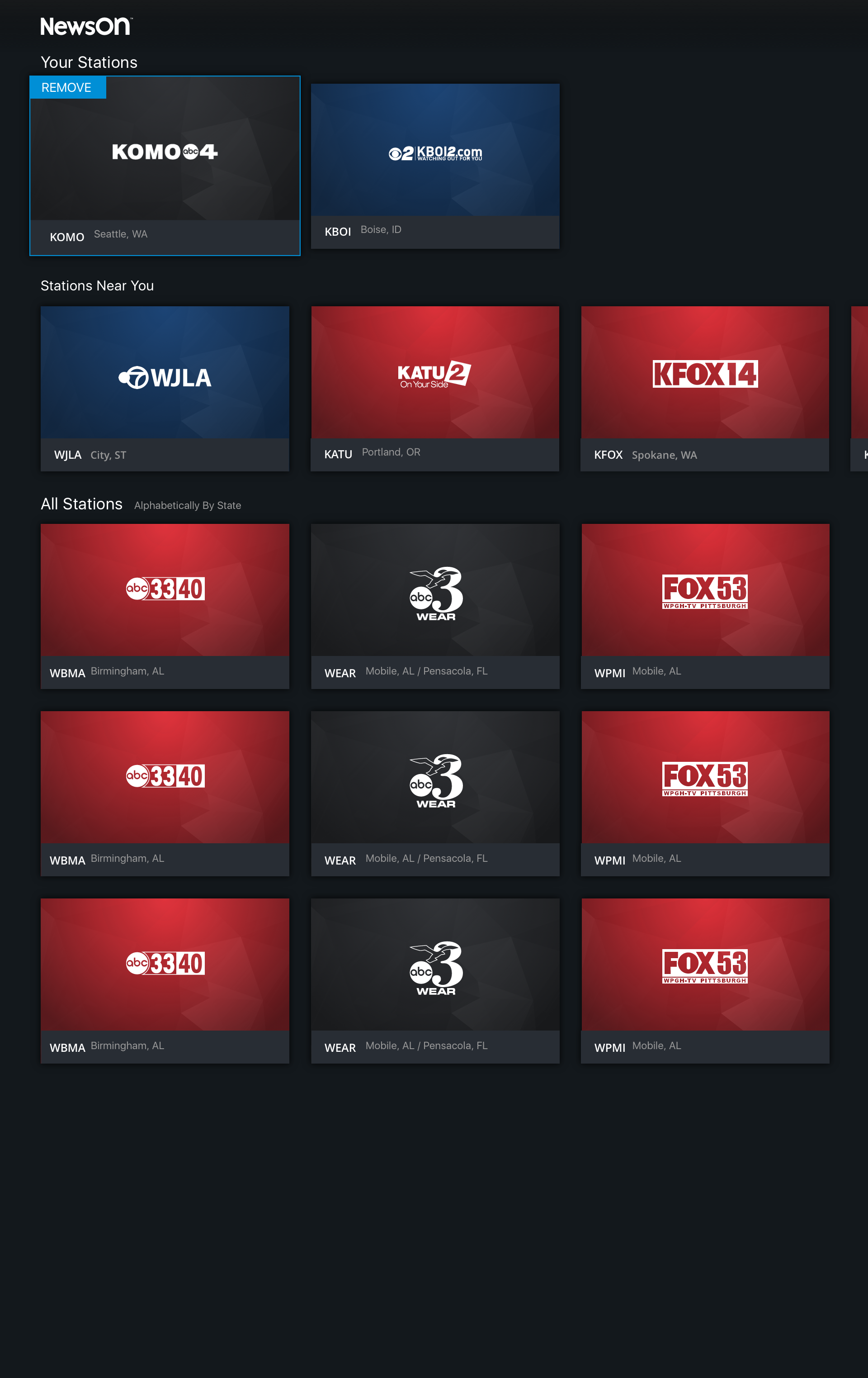
Users would need a place to manage their stations and the plan was to combine the list of currently favorited stations with the ability to find new stations.
Version 1: Your Stations With GeoLocation
We knew that we were able to geolocate the user and so this version would simply show the users just the nearest stations to them. The vast majority of users were only subscribing to stations near them so there was a discussion to be had if this would be sufficient.
Version 2: Your Stations With Geolocation and All
Even though most users only subscribed to their local stations the other side of the argument is why should we limit the users here. If they want to watch the local news of the station they grew up with or from where their grandmother lives across the country why shouldn't they be easily able to.
Watch Experience
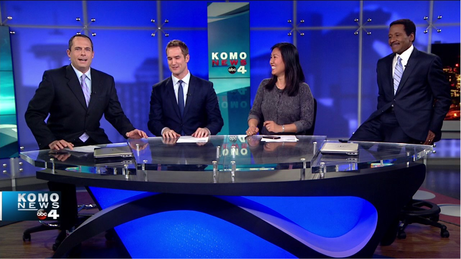
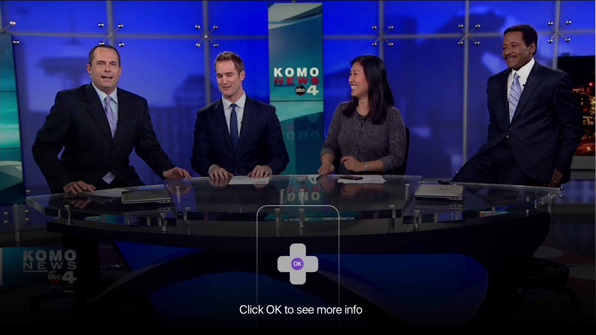
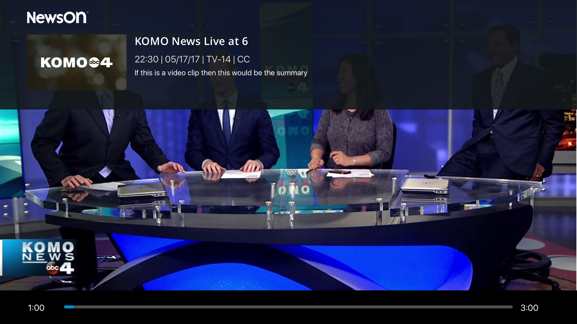
Full screen experience would largely use Roku conventions and when paused bring up the station/new cast information.
Search Experience
In the previous version of the app search functioned differently depending on where the user found the search from. If they were in the station section the user could search to search to find stations by call letter but in other places a search of the city would bring up the stations while still in others the search functioned as a keyword search for content. This need a dramatic simplification.
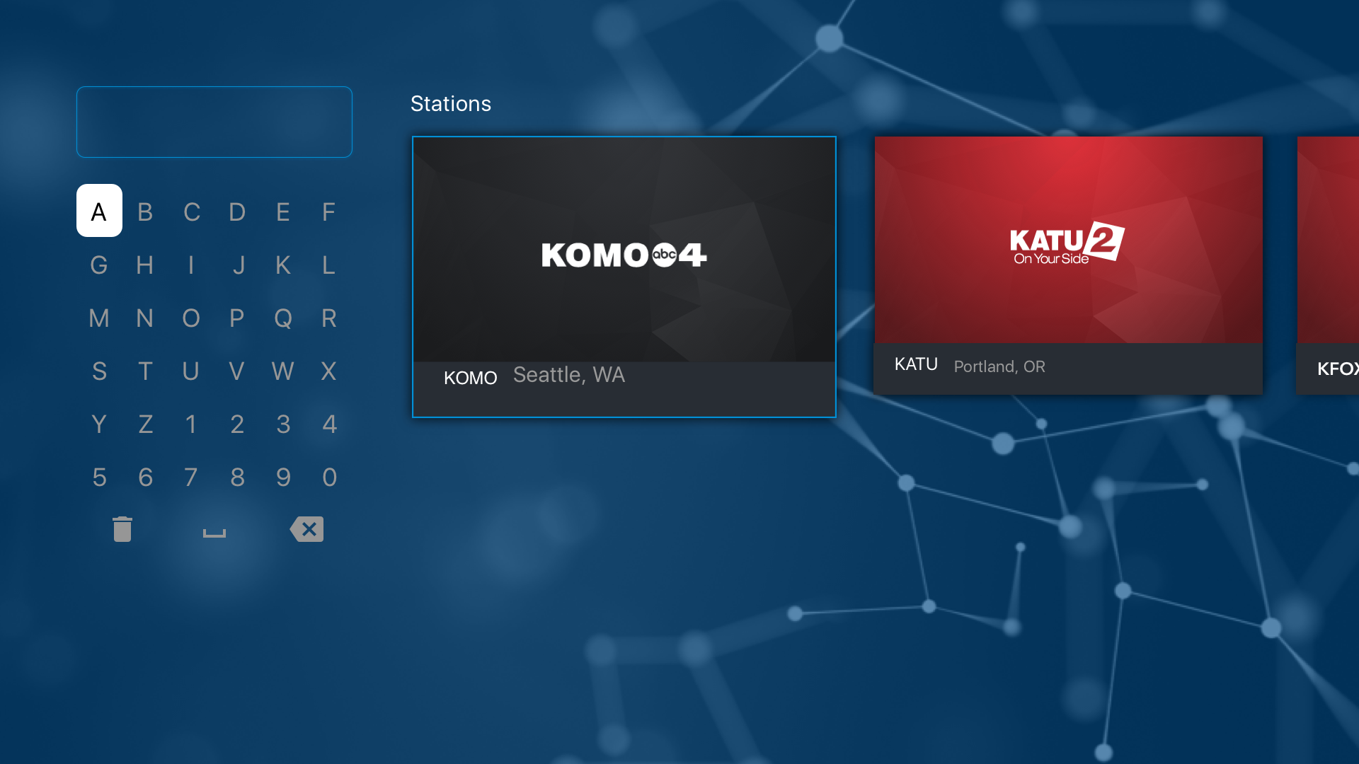
A unified search would search for stations and clips all in the same place, regardless if the user searches for call letters, station name or city all search is in the same place. User first results would be stations (which they can add to their favorites from here) and search clips/newscast based on the word searched.
Revisions
Results
After initial designs were reviewed with the stakeholders a series of revision were needed.
Home
This primary update to the home page was the the larger autoplaying hero, the thinking being that it would better showcase the content. Additionally the ability to manage your stations was added to the station naviagtation rather then being in the app menu.
Breaking News
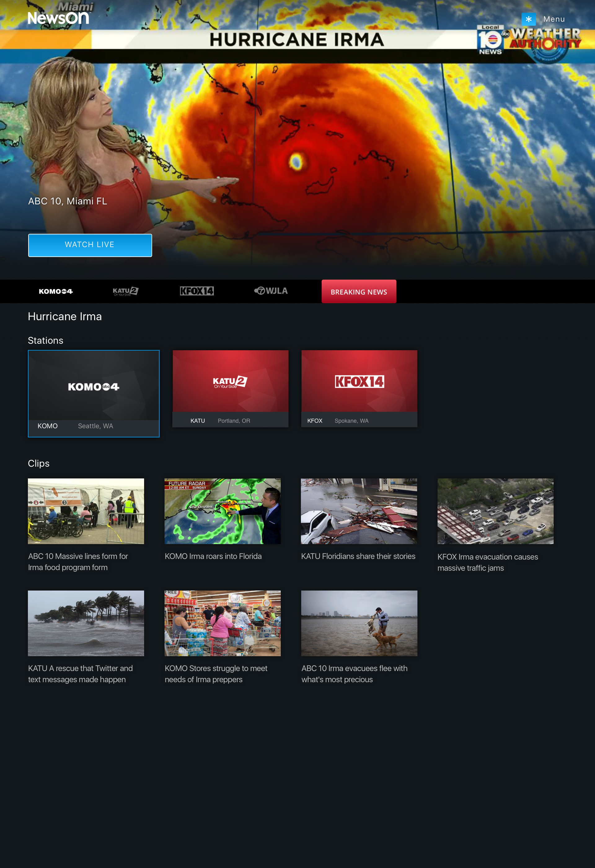
Given the nature of news a request came in for the ability to promote breaking news in case of an emergency or major national news story. If an important story were to come in, something like a major hurricane, a "Breaking News" badge would appear in the station bar allowing the user to quickly get to the news coverage.
Once on the Breaking News Page the user would be met with an autoplaying hero of the first stations live stream. Below that the users would be able to see other stations that were covering the event live as well as relevant clips/past newscasts.
EPG
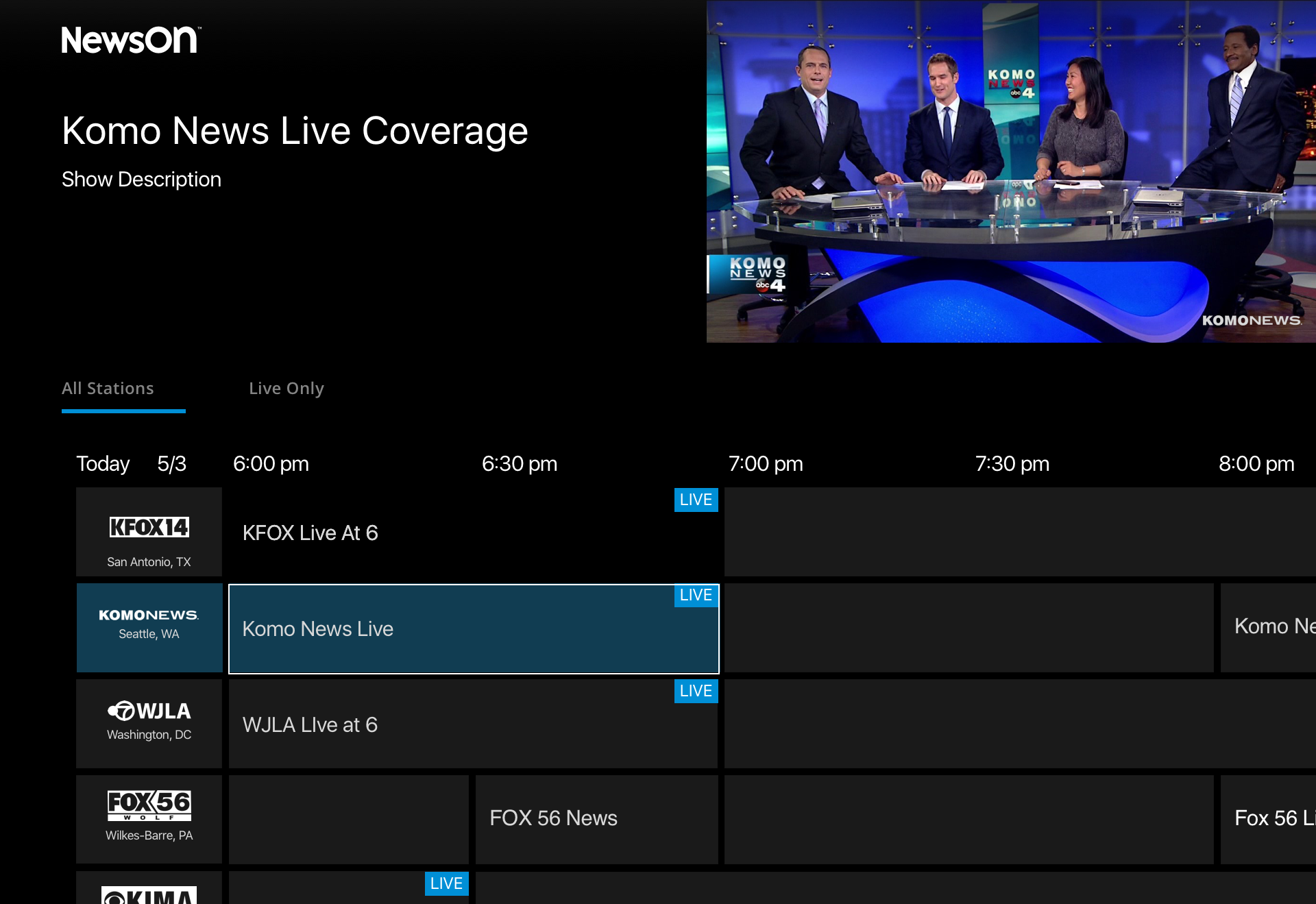
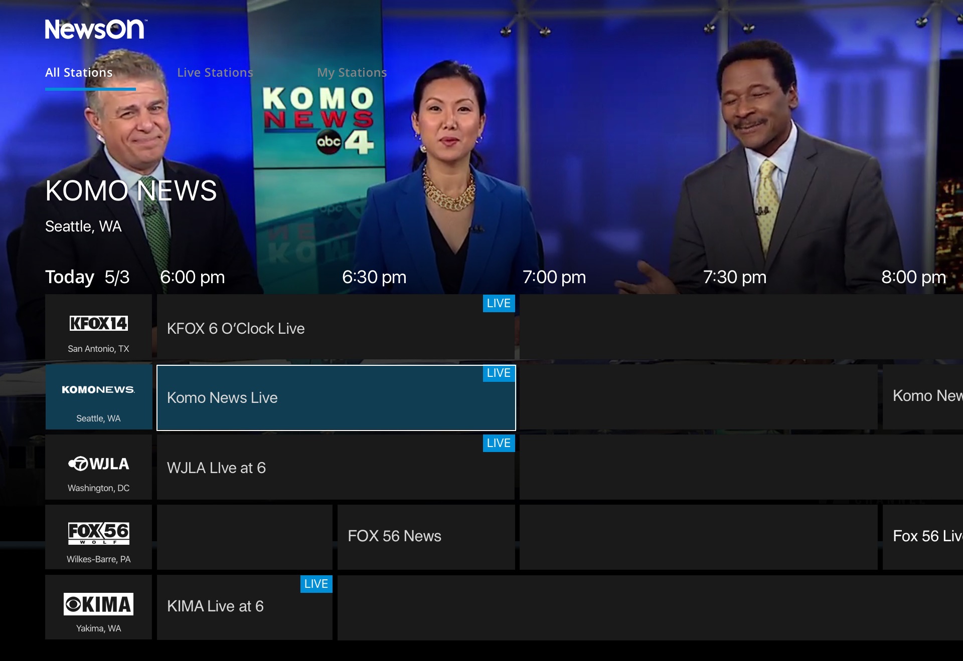
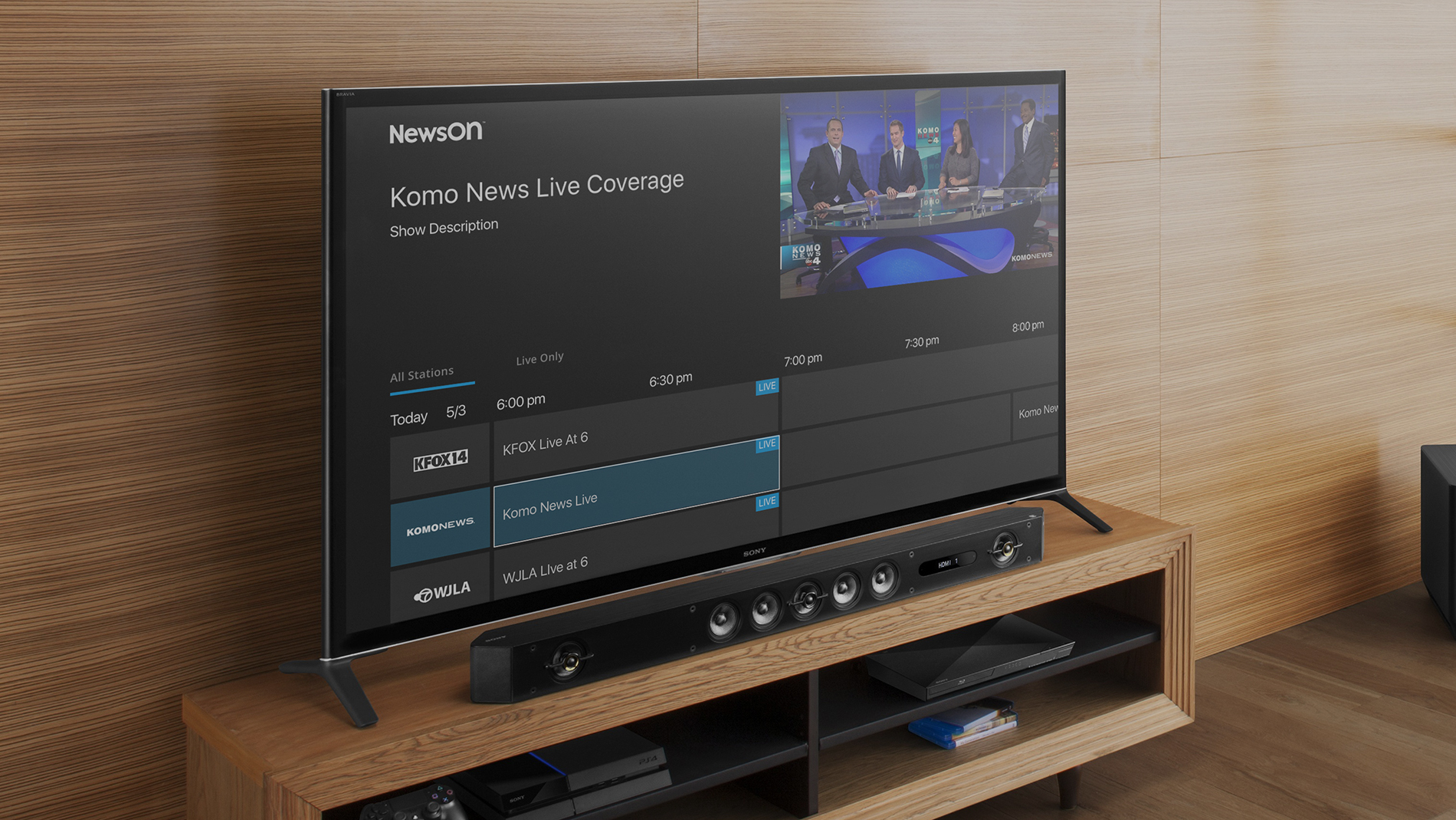
Though a future request I explored to initial designs for the EPG. Taking into account conventions used by other similar services as well as what users were familiar with from their cable experience.
Given the technology we were only able to populate the content of a station when it was having a newscast that was available via NewsOn.
Version 1: Small Player
Much like the traditional EPG of a cable provider this version allows the user to quickly "flip" between channels. Additionally has the option to filter based on just currently live content.
Version 2: Large Player
This uses the larger player instance used on the station page. In addition to being able to filter by live content also allows the user to filter just their stations.
Show Page
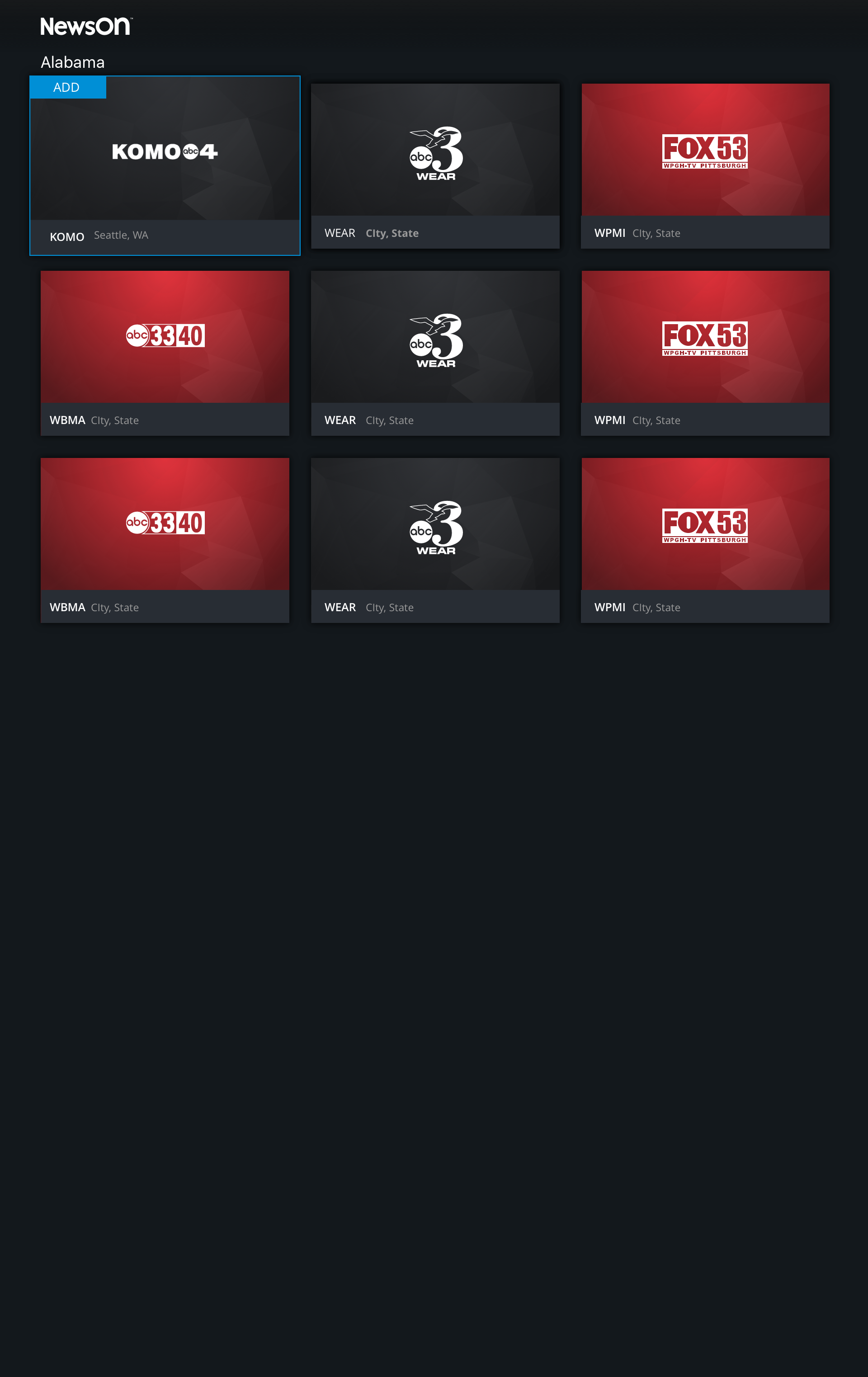
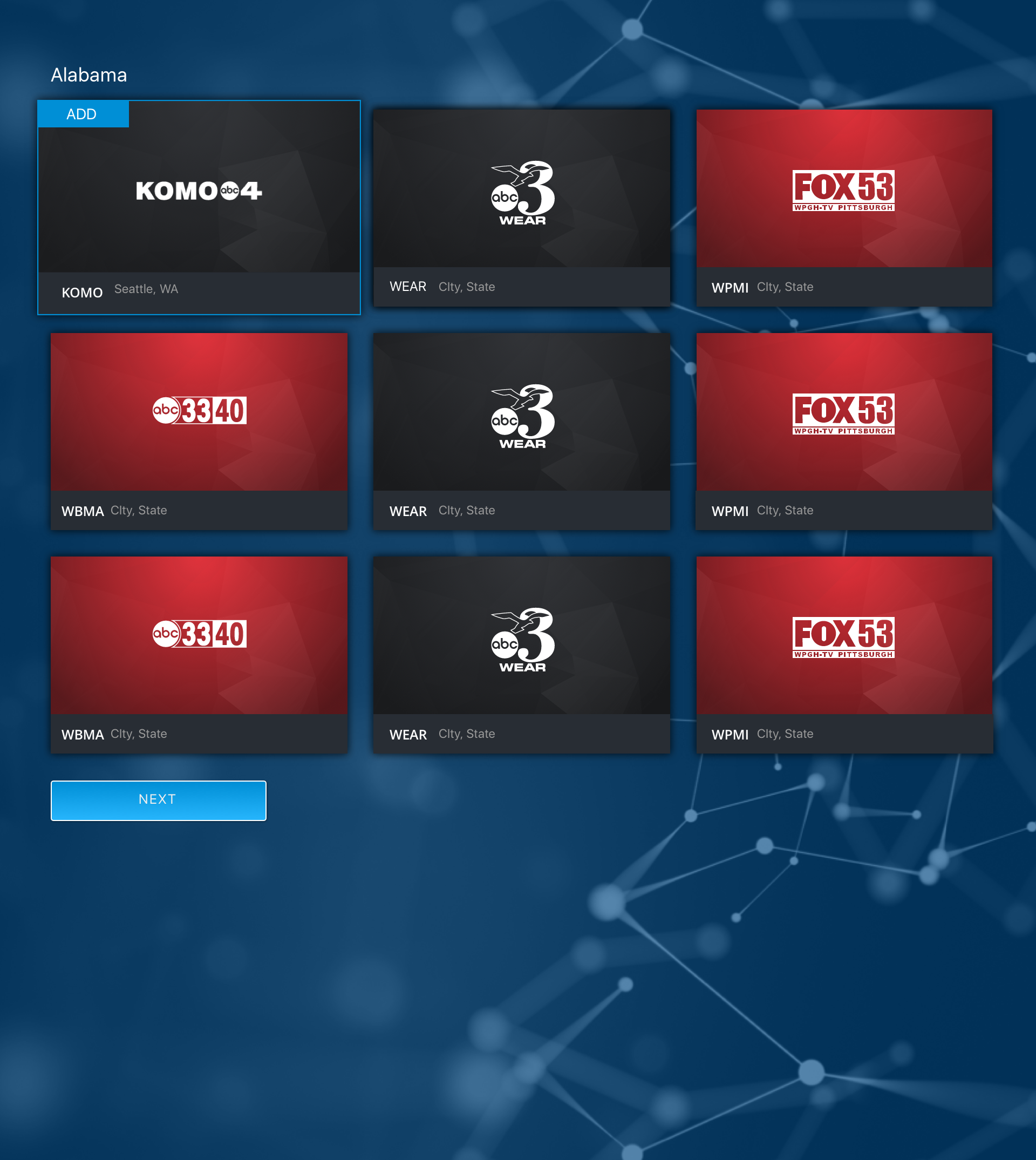
To allow for ease of navigation and discovery rather than listing all stations A-Z or having different carousels for each state I changed the experience to a grid of state that the users would be able navaigate to and see only the stations from that station.
Onboarding Experience
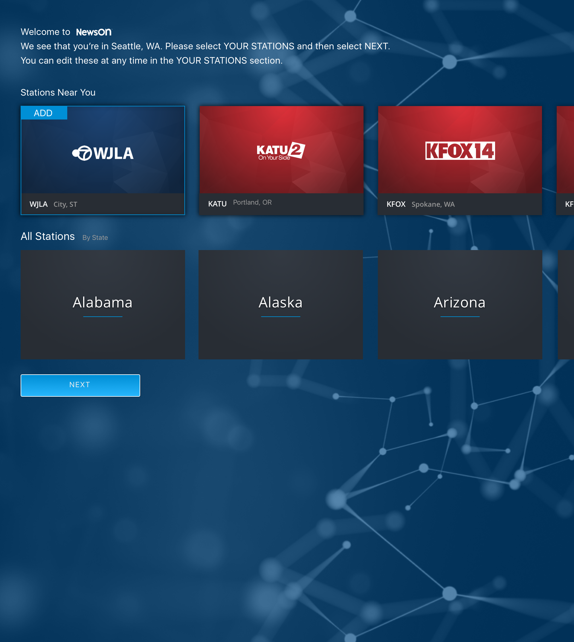
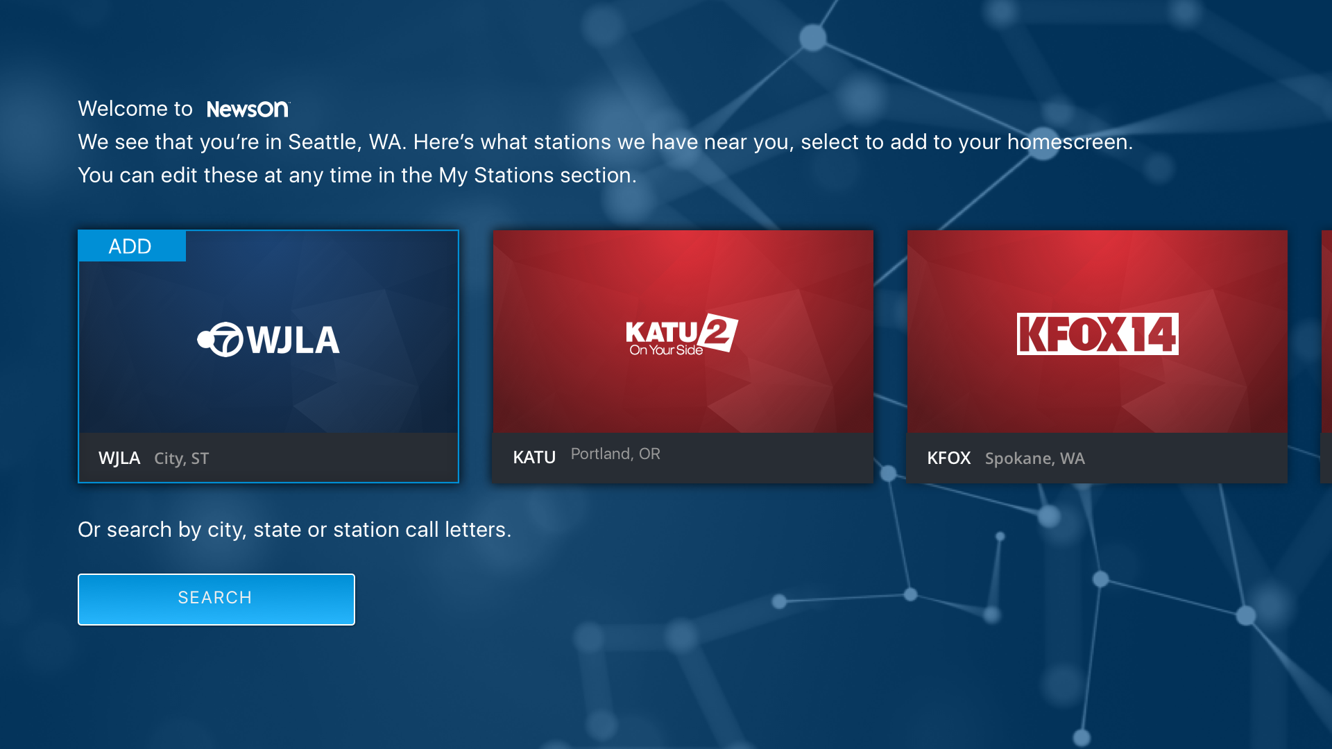
Since we were basis so much on the users favorite stations it seemed to me that it was important to have a very basic onboarding experience.
Version 1: My Stations
The first version would mimic the favorite experience in the app, first showing a list of nearby stations and then below utilizing the state buckets.
Version 1: Search
The second version would first use geolocation to suggest nearby stations but would then give the user the option of searching for stations by city, state, or call letters.

